South Cali Steak Burger Bar - MENU REDO

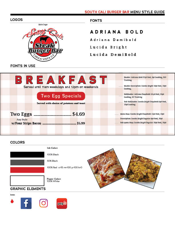
The Style Guide/Format
The Menu Before
The original menu was dark, unorganized and not formatted well. The owner of the restaurant wanted something with an American Diner feel to it.
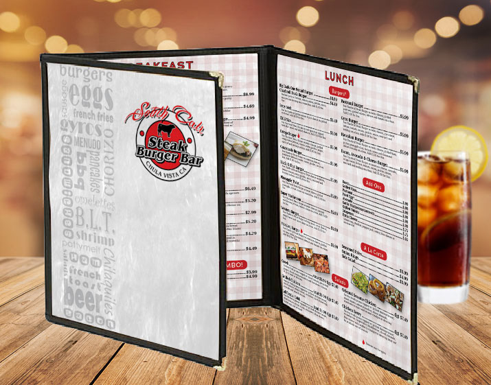
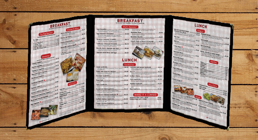
The Red/Black/White color scheme is very clean and give the feel of the American Diner. The opaque red and white checker background gives a nice texture to the inside.
The New Menu
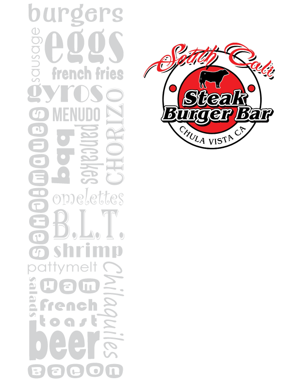
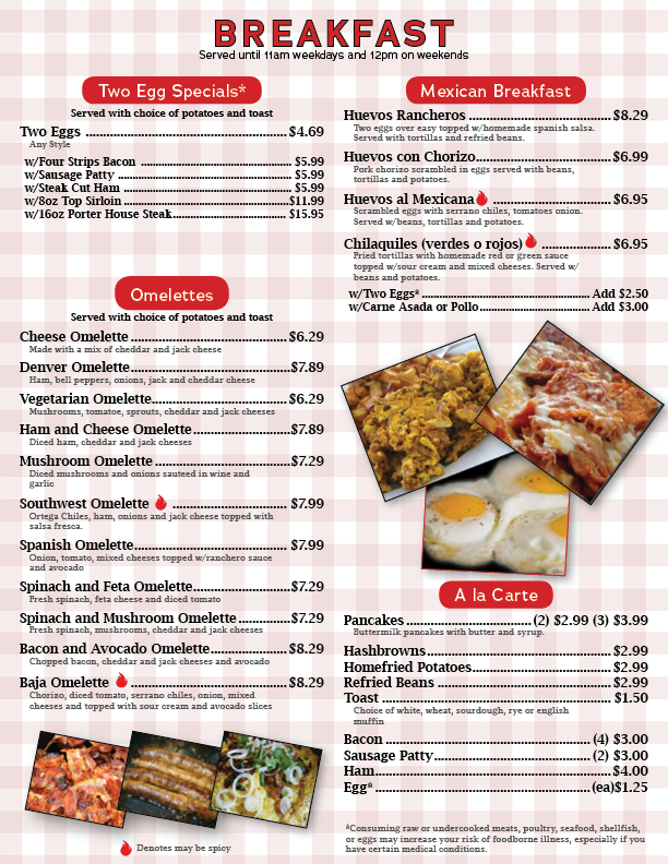
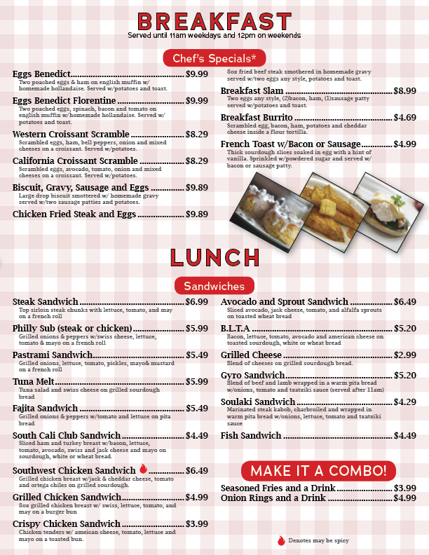
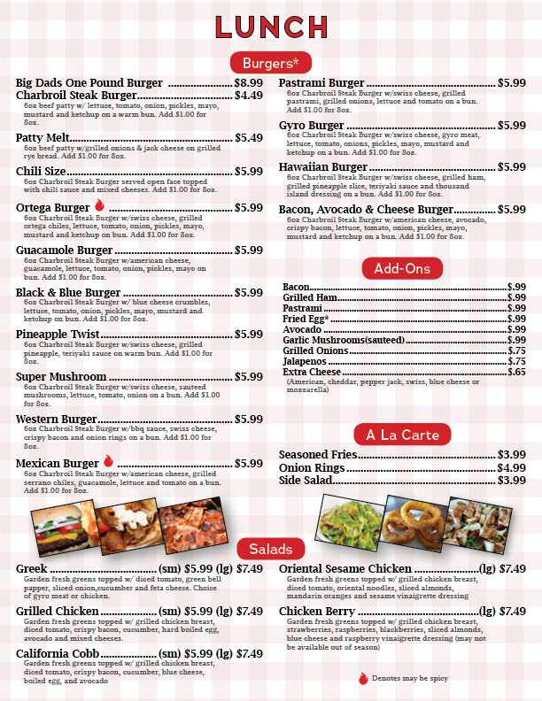
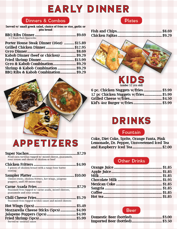

The restaurant has a wide variety of items and needed to be organized in a way that would be easy to understand.
Before and Afters
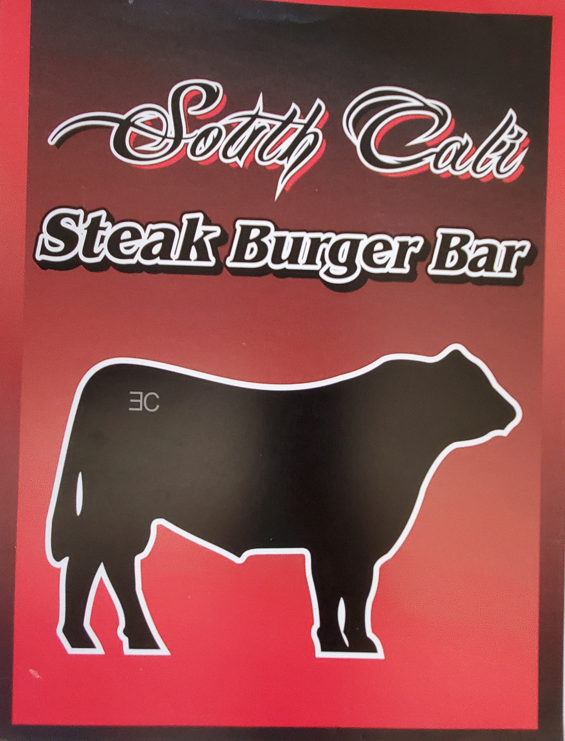

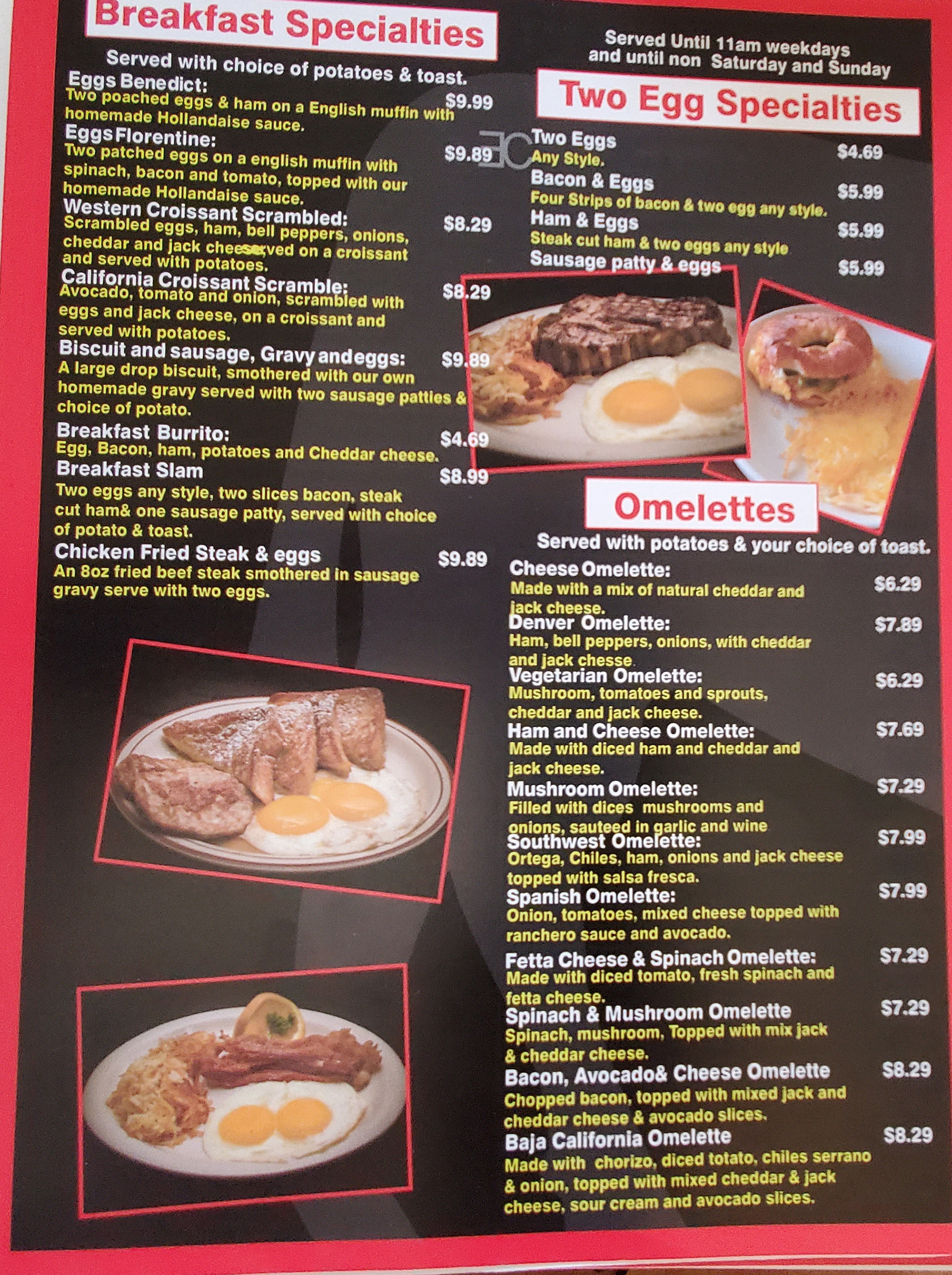

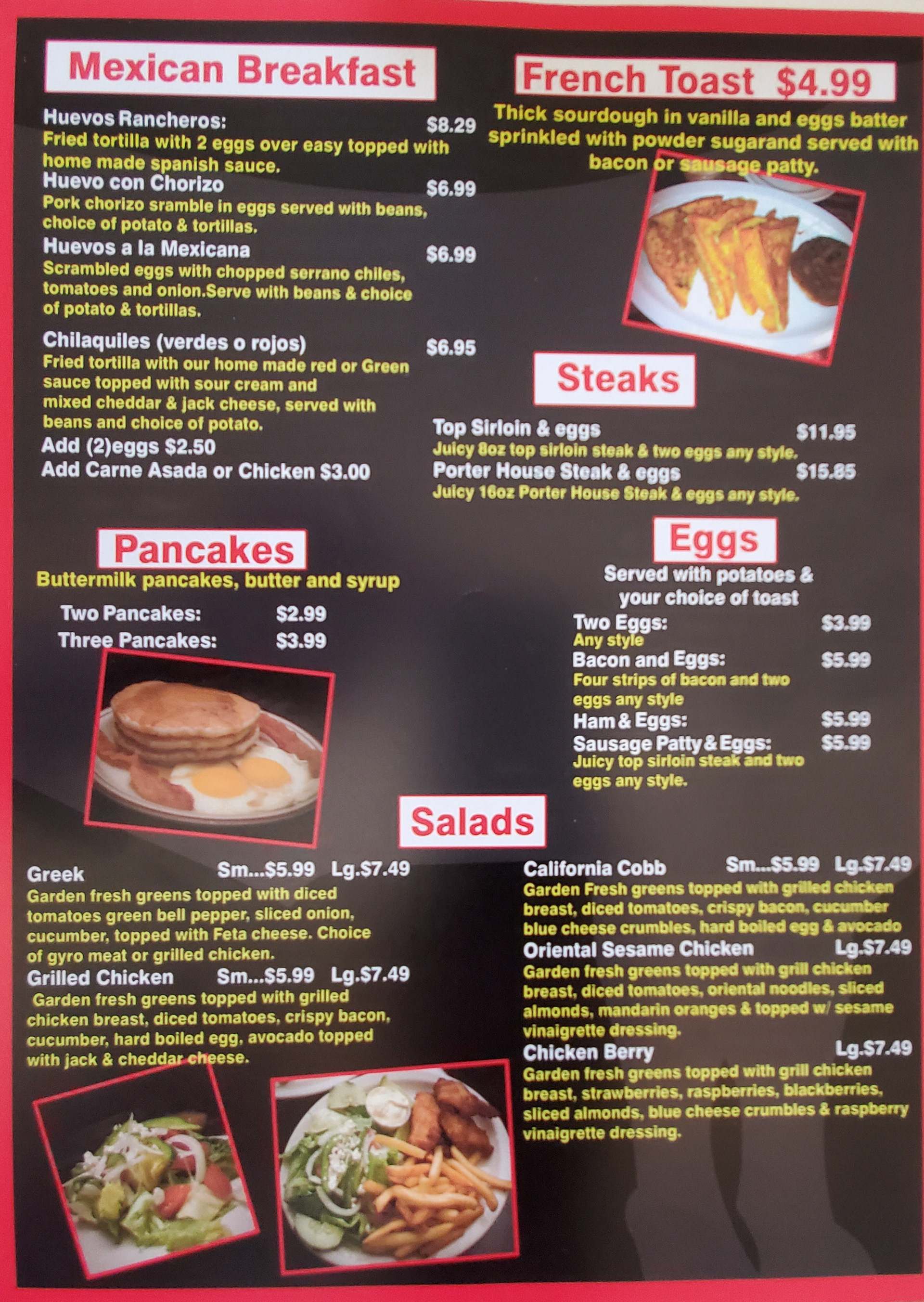

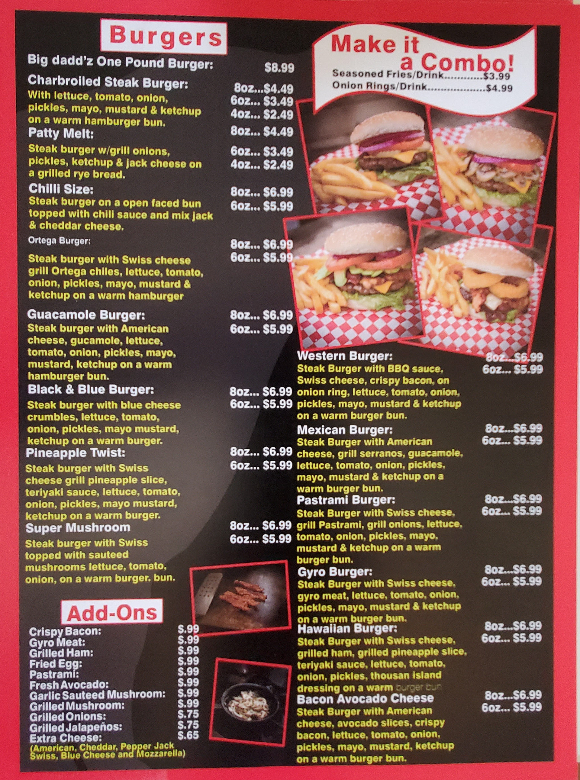


Some Examples
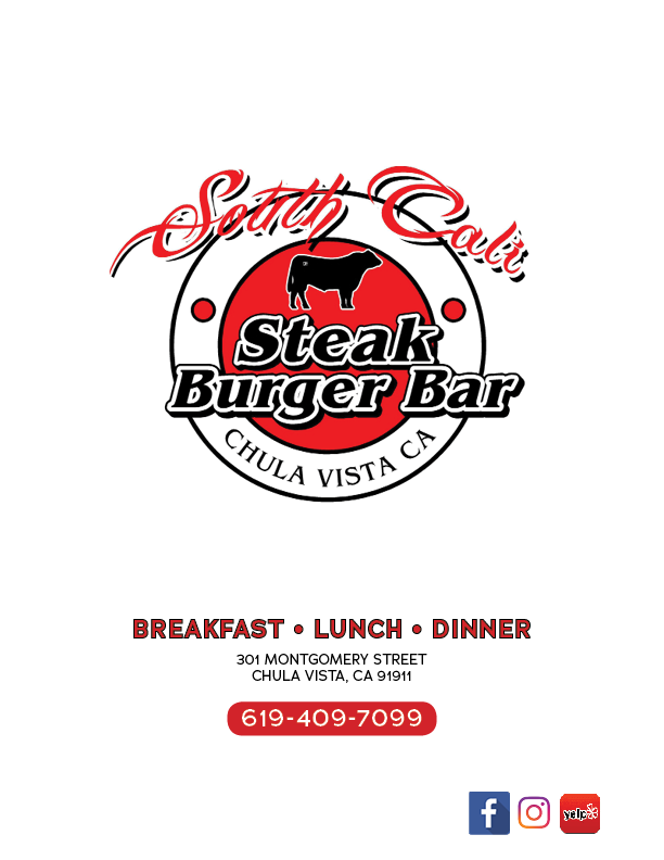
There is six total pages with the front and back cover. The 8.5" x 11" pages are inserted into a clear trifold menu cover.
